Purpose
Enable teams to orchestrate people, data, and AI with operational clarity and measurable outcomes.
Official brand standards
This document defines how NitroFlow should look, sound, and behave across product, marketing, and communications. It is the source of truth for consistent and professional brand execution.
Enable teams to orchestrate people, data, and AI with operational clarity and measurable outcomes.
Precise, confident, and human-centered. We communicate with clarity, never with unnecessary complexity.
Direct, pragmatic, and trust-building. We explain systems in actionable terms and avoid empty hype.
Use the official NitroFlow logo variants based on background contrast. Keep clear space equal to the height of the logomark icon.
Light background
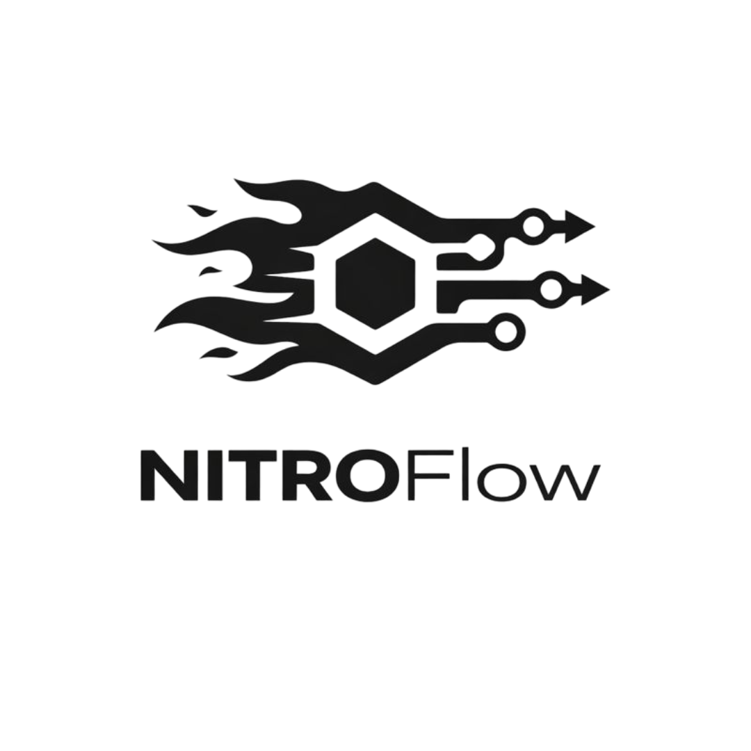
Dark background
NitroFlow uses tokenized colors to keep product and marketing visual output aligned, scalable, and accessible.
--md-sys-color-primary
#4F46E5
Primary actions and key highlights.
--md-sys-color-on-primary
#FFFFFF
Text and icons on primary surfaces.
--md-sys-color-secondary
#475569
Supporting UI emphasis and metadata.
--md-sys-color-tertiary
#0D9488
Expressive accents and state emphasis.
--md-sys-color-surface
#F1F5F9
Application and page backgrounds.
--md-sys-color-on-surface
#0F172A
Primary text and iconography.
--nitro-accent-chaos
#FF6B35
Marketing energy accents and badges.
--nitro-accent-flow
#818CF8
Marketing gradients and chapter highlights.
Inter is the primary typeface across product and marketing. Maintain hierarchy with tokenized type scales.
Display
NitroFlow turns operations into clear execution.
Headline
Build systems people and AI can execute together.
Title
Precision over noise, clarity over clutter.
Body
Use concise and direct language. Keep copy actionable and outcome-driven.
Use rounded geometry, subtle depth, and clear boundaries. Build UI from semantic tokens for maintainability.
Prioritize legibility in all states. Use on-surface/on-primary text roles and avoid decorative-only information.
Use visuals that communicate orchestration, structure, and progress. Favor clean compositions and contextual product storytelling.
Use consistent stroke/weight and semantic meaning. Keep icon usage supportive, not decorative noise.
Download and use only approved files. If you need additional formats, request them through the NitroFlow team.
Need implementation context? Visit the Integrations page for ecosystem framing.